
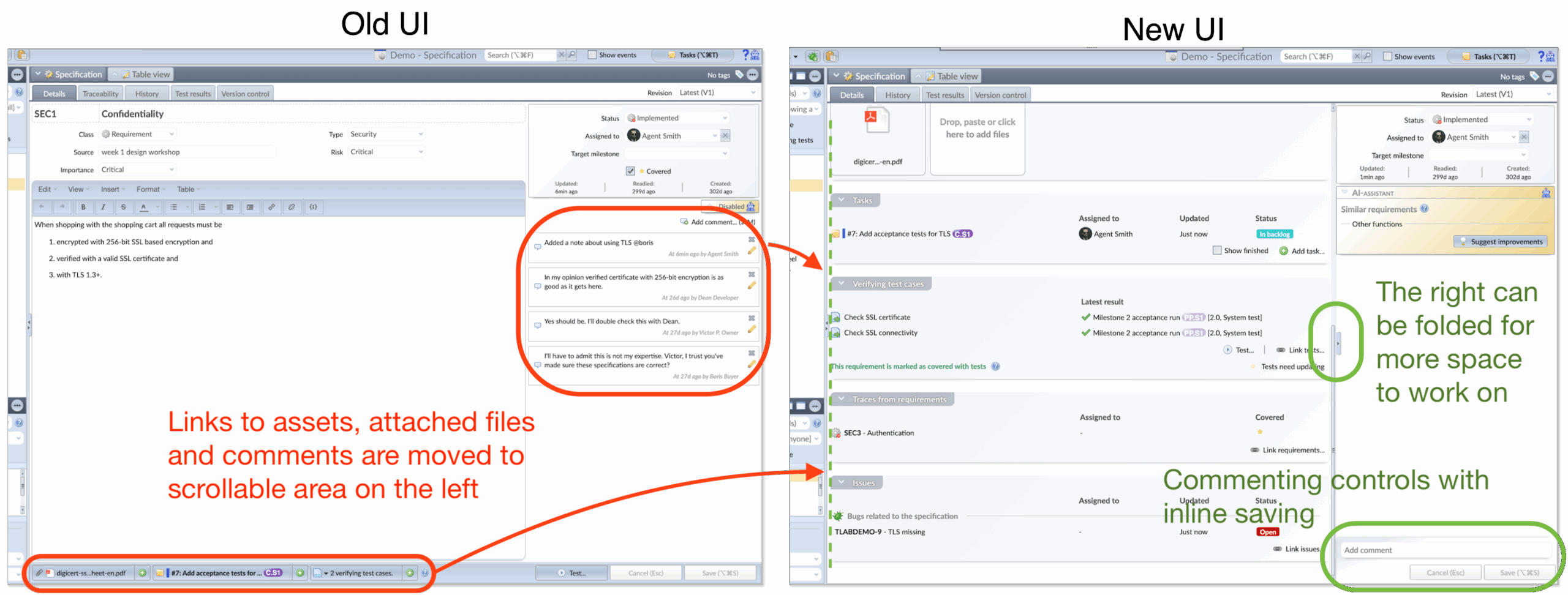
The user interface of Testlab was modernized in the Oak Island release. The idea was to make the relevant information more accessible to the user – bring important data behind button clicks more accessible on the screen, and use the screen space more effectively. To make this all possible, the middle part of the screen was made scrollable.
The change affects the Specification, test case design, and issue views.
The changes in the layout
1. New rich text editor for descriptions
The new editor takes only as much space as it needs to show the contents of the description. The control buttons for editing are shown only when editing the content – to start editing, just click the description field.
You can now add images directly to the description using the clipboard to copy – paste, or by clicking the image button of the editor.
2. More space for comments
Comments are moved from the right part of the screen to the center. By default, the UI shows only the newest comments, but you can tick the checkbox to see the older ones. By default, the system hides comments older than 90 days, but you can configure your own preference from your account settings screen.
The commenting has also been renewed – please see “New way to comment on assets” below.
3. Relevant information from linked items shown on the form
The related information, like file attachments and related issues, is now listed in the form for easier readability. These lists show more information about them in the form itself.
The items are listed in tables, and items have functions in the row-specific context menu that can be accessed from the button at the end of the row or by clicking the right mouse button. As familiar from before, the items can be navigated and/or opened in a new window by holding down the Ctrl (Cmd) key.
4. Related actions are included in each panel
Related context-specific actions, like testing the specification or issue and linking assets, can be initiated by pressing appropriate buttons in each panel.
New way to comment on assets
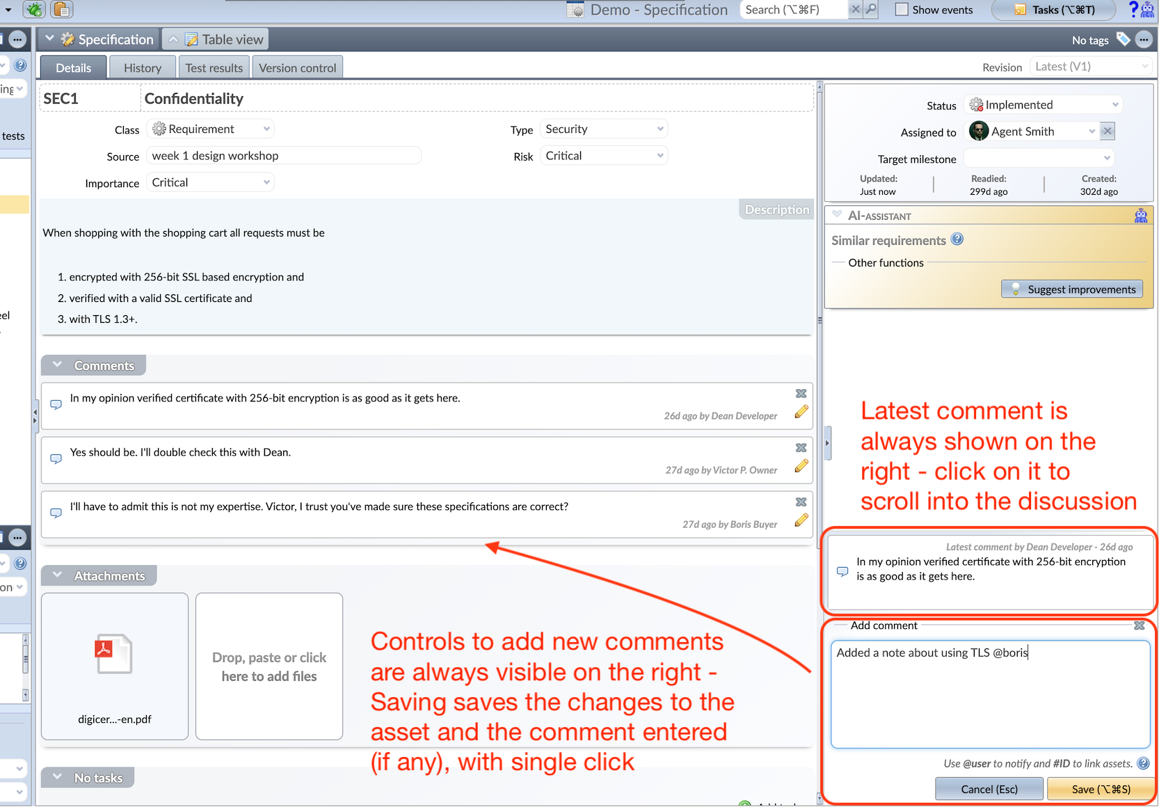
As said above, the comments (in the specification, for issues, and for test cases) are now shown in their own foldable panel in the left-hand side scrollable area. In this new way to present comments,
- If someone else than you has commented on the asset, the latest comment is also always shown on the right. You can click on the comment to easily access the discussion in the scrollable area.
- New comments are entered with controls on top of the Cancel and Save buttons, and the entered comment (if any) is always saved with other changes with a single click.
Other changes
- Folding the right side for more space: In the middle of the separating scroll bar, there is a grip button to fold the right-hand side for more screen estate.
- Font size increased: The font size has been increased for better readability.
- Image thumbnails: The attachment panel shows the thumbnails of the image files, so accessing relevant files is easier than before.
- Covered by test cases: The control to mark if the specification/requirement is covered by test cases or not – used when planning the testing – is moved to the verifying test case panel of the specification form.
- Related issues in specification: Related issues of each specification are now shown on the form. For example, when defects are recorded when testing with verifying tests, the defects are shown as related to the verified requirements.
- Traceability from one requirement to another: Traceability used to be presented on a different tab. Now this information is on the Details tab, along with other related data.
Meliora Testlab Team